-
As WWDC approaches, people often write about their wishlist for tentpole iOS features in the next update. I think it'd be interesting to look at the other-end of the product-management list, and think about some much-smaller improvements.
-
Custom Navigation Transitions, Part IV: An Interactive Pop Transition
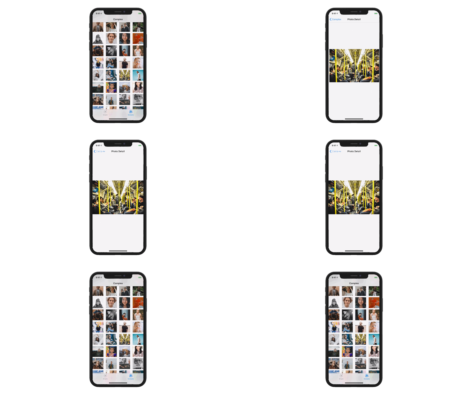
In the fourth (and final) post on navigation transitions, we'll build an interactive drag-to-dismiss transition, like the one in Apple's photos app. We'll continue the implementation from the previous post, by adding a pan-gesture to the photo-detail screen, and using that to drive a transition animation.
-
Custom Navigation Transitions, Part III: A Complex Push/Pop Animation
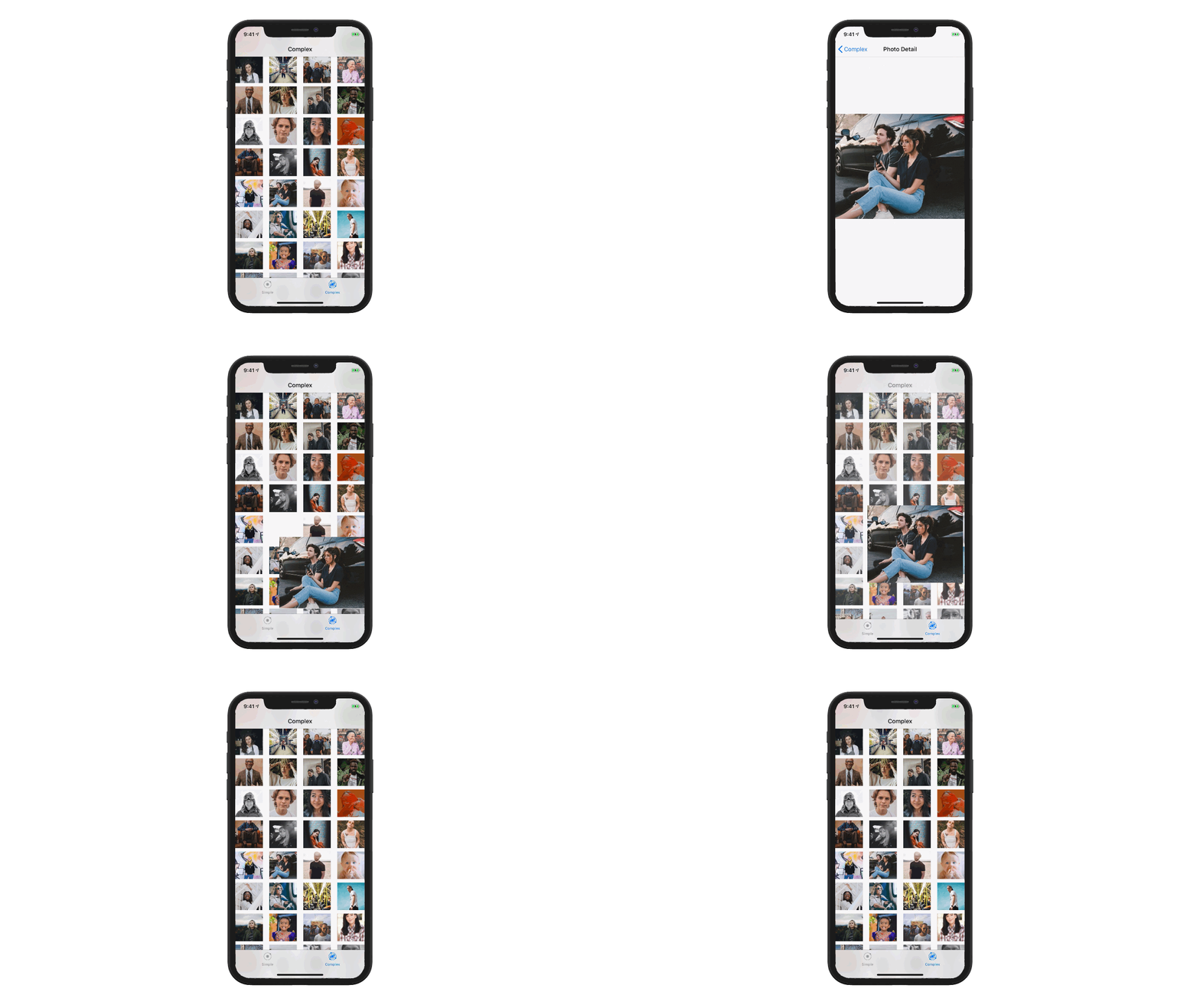
In the third part of our custom navigation animation series, we're going to implement complex push/pop transition animations, where tapping an image in a grid makes it expand to fill the screen, and tapping the back-button scales the image back into the grid.
-
Custom Navigation Transitions, Part II: A Simple Modal
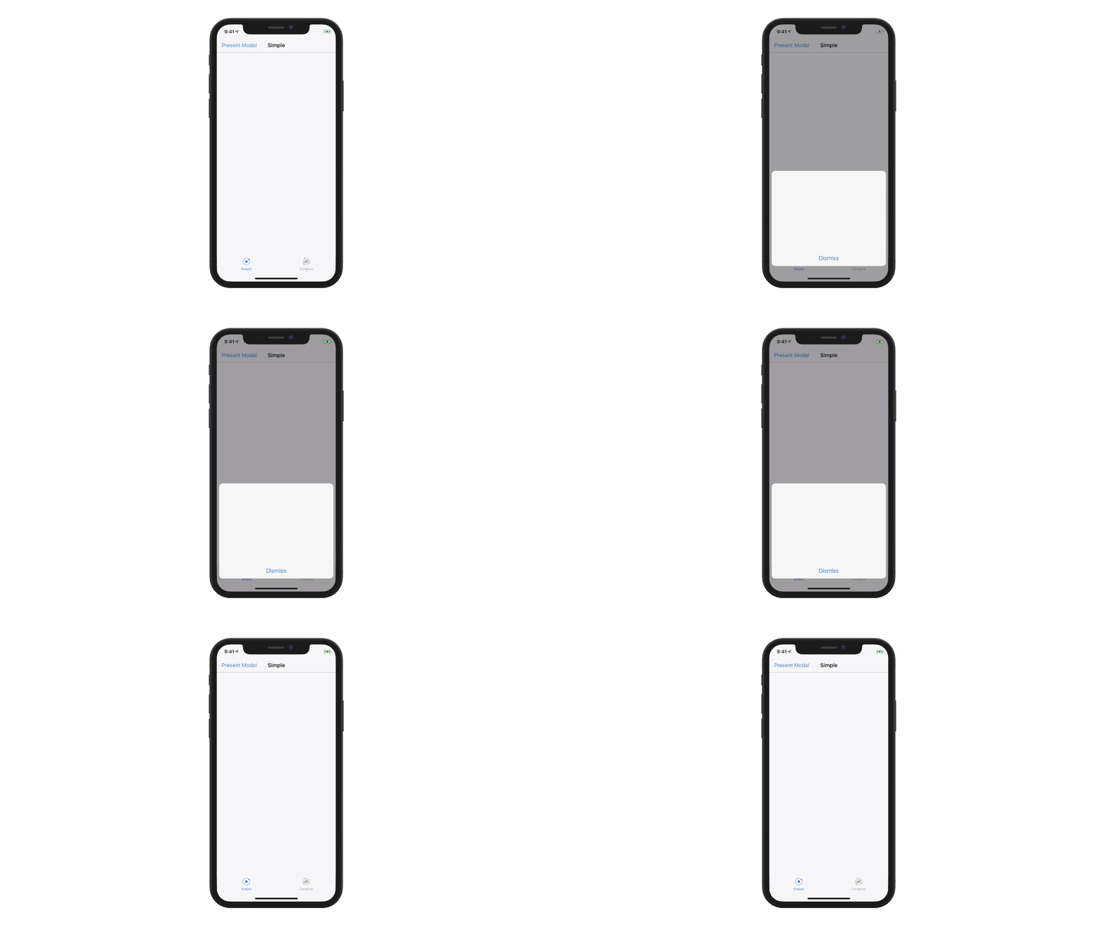
In part two of the navigation-animation series, we'll implement a simple, self-contained custom modal navigation animation. Along the way, we'll learn more about UIViewControllerTransitioningDelegate, UIViewPropertyAnimator, and UIViewControllerAnimatedTransitioning.
-
Custom Navigation Transitions, Part I: An Introduction
Custom transition animations are a vital part of interaction-design in any great iOS app. In this post, I'm starting a series on understanding and implementing this often-daunting feature — starting with a high-level introduction to the API.
-
How does your design handle changes over time? Is it frantic? Inaccurate? Does it have twitchy loading states or behave oddly as a user interacts with it? Here are a couple of terms to describe systems that have to change quickly over time - learn 'em and you'll be able to incorporate them into your designs.
-
A look at SubtleVolume by Andrea Mazzini.
-
Creating Focus Effects in tvOS
Introducing CustomFocusEffect, a way to add UIFocus to non-roundrect UI elements in tvOS.
-
Grading Your App with a Weighted GPA
A couple of years ago, my team was trying to figure out how to advocate for quality and polish in our app. The “design nitpick P4s” were piling up, and we felt that marred the legibility, usability, and branding of the product - but each individual bug was so minor, they tended to lose out when compared one-on-one with other issues.
-
Eventually, Everybody’s An Edge Case
Let’s say you’re making A Thing For Humans To Use. It has Many Features, and that Sometimes, Bugs Are Discovered. How you measure and prioritize those bugs impacts who gets a perfect product and who doesn't - how do you choose who gets treated like an edge case?
-
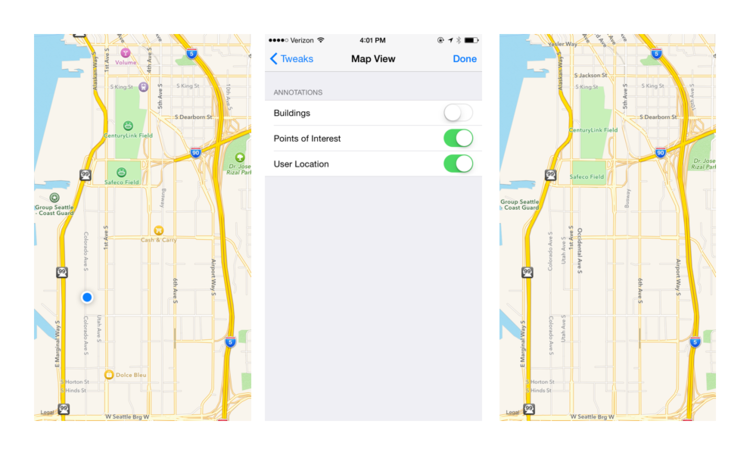
Sometimes, when you're designing an interface, you need a MKMapView to drop in to your screens — one without points of interest, buildings, and other clutter.
-
If you're interested in exploring WatchKit, check out @NatashaTheRobot's write-ups.
-
Tracking & Character Spacing in iOS
In tools like Photoshop and InDesign, tracking is the term that describes the relative amount of spacing between characters in a string of text. Unforunately, iOS doesn't natively support tracking — instead, it has character spacing. Here's how to convert between the two.
-
If you aspire to be really, truly great at creating things, you need to have an eye for what "great" means.
-
Prototyping, Part I: Static Prototypes
Whether you've got sketches, wireframes, or visual designs, it's really helpful to create a walk-through to demonstrate a user flow.
-
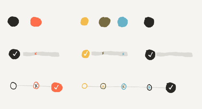
How I set up default styles in my Sketch docs, to help me easily measure layouts and mark something as not-yet-designed.
