Custom Navigation Transitions, Part I: An Introduction
This is the first in a series on navigation transitions. To kick things off, let’s get a simple preview of the big-moving-pieces in a navigation transition. In future posts, I’ll write about how I’ve come to think about these APIs and compose them in non-trivial iOS implementations, like the ones in my app, Locket Photos.

Every project has one: a feature that will make a big contribution to the quality of the product, but the first steps of that implementation aren’t immediately obvious, so you kick that task down the road, because the costs seem too high.
For me (and many other iOS peeps), custom navigation transitions are totally one of those daunting features. They were introduced with iOS 7, are important for spatially explaining your app’s layout. They’re an affordance for the fluid, interruptible gestures that make it a breeze to float around iOS. If you want your app to feel excellent in-hand, then you’re going to want to implement these APIs — but it’s hard to know where to start, and even harder to know how to avoid a glitchy, jittery result.
Implementing a non-trivial, non-glitchy transition is a challenge. The WWDC videos are confusing, Apple didn’t provide source code with them, and while there are many “Hello World” tutorials out there, I find that these implementations get tangled in a non-trivial implementation. When that happens, I’m often inclined to revert my changes and say “well, I tried it, but the effort required is just too much for me right now” — and then the feature never gets built.
I know for a fact that I’m extremely-not-alone in finding these APIs to be so intimidating. And yet! I believe there’s a way to describe these APIs in a way that might help.
The APIs for this are powerful and flexible, and for good reason: you can compose them in a variety of ways to suit your app’s architecture and design needs. However, this flexibility also includes a lot of upfront complexity, with a large cast of characters — so before we write code, let’s simplify the shape of the API.
Simplifying the API Documentation
At first glance, the documentation for view controller transitions is scary. There are many protocols, and it’s not immediately obvious how they relate to each other — or how they fit into your app’s architecture:
protocol UIViewControllerTransitioningDelegate
protocol UIViewControllerAnimatedTransitioning
protocol UIViewControllerInteractiveTransitioning
protocol UIViewImplicitlyAnimating
protocol UIViewControllerTransitionCoordinator
protocol UIViewControllerTransitionCoordinatorContext
That’s a lot of protocols! It’s not clear where to start, the names are tricky, there are “ing” suffixes everywhere, and to make things harder, these protocols bounce around in a complicated dance — here are a few screenshots from the WWDC video that introduces these APIs:

Those are some scary-looking diagrams! I still find them to be head-scratchers.
Let’s simplify this list of protocols: we’ll remove some, drop the goofy “ing” suffixes1, and add some informal descriptions:
UIViewControllerTransitionDelegate: tells the system that you want a custom transition.UIViewControllerAnimatedTransition: the transition animation.UIViewControllerInteractiveTransition: an interactive transition.
That’s a little easier to understand, right? Now that we’ve got these three principal protocols, we’ll want to talk about
which classes in your app will conform to them. Where does the animation live -
is it in your UIViewController, or do you need to build a new class to control
the transition?
The answer is: it depends — so how can we make ourselves more comfortable in taking our first step here? I suggest we compare two implementations in Locket — and in future posts, we’ll walk through implementing them, including the little details.
Locket’s Transitions
Currently, Locket has two custom transition animations: a simple, self-contained modal presentation, and a complex one that mimics Apple’s Photos app. I’ve included half-speed GIFs of the transitions, so you can see the details in-action.
Simple Modal Transition
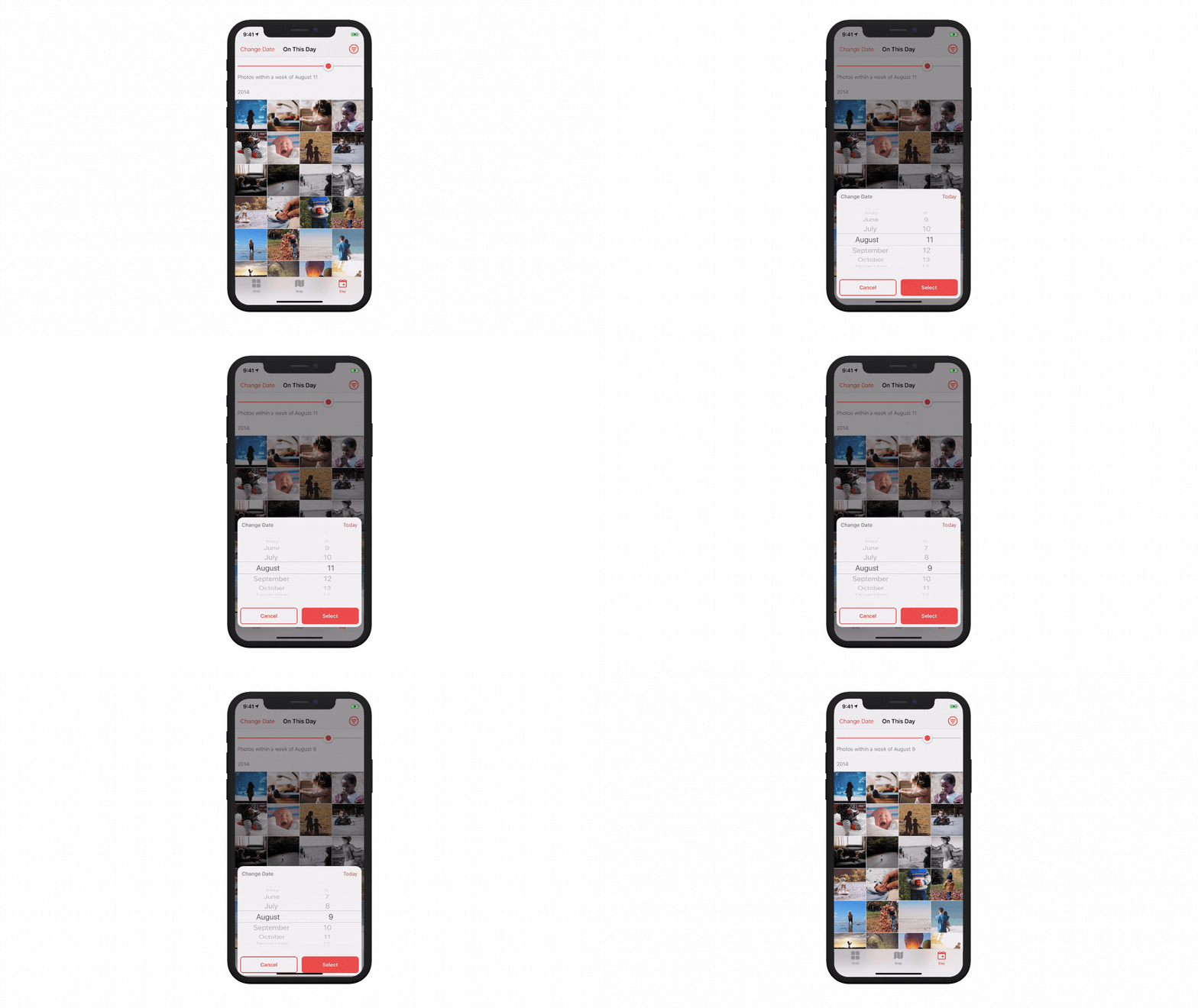
First, let’s talk about the simple modal transition for its Select Date screen. In this transition, the card slides-up with a springy overshoot. When dismissed, it falls offscreen. Here’s a half-speed look at the animation:

Here’s a rough diagram of how the view controller manages its own modal presentation animation:

Do you see how all of the guts of the presentation are self-contained? You
could present this view controller from anywhere, and it’d still have the custom
animation — because it’s its own transitioningDelegate, and conforms to the
appropriate protocols internally. (I imagine that UIAlertController has a
similarly self-contained architecture, but I can’t say for sure!)
Complex, Interactive Transition
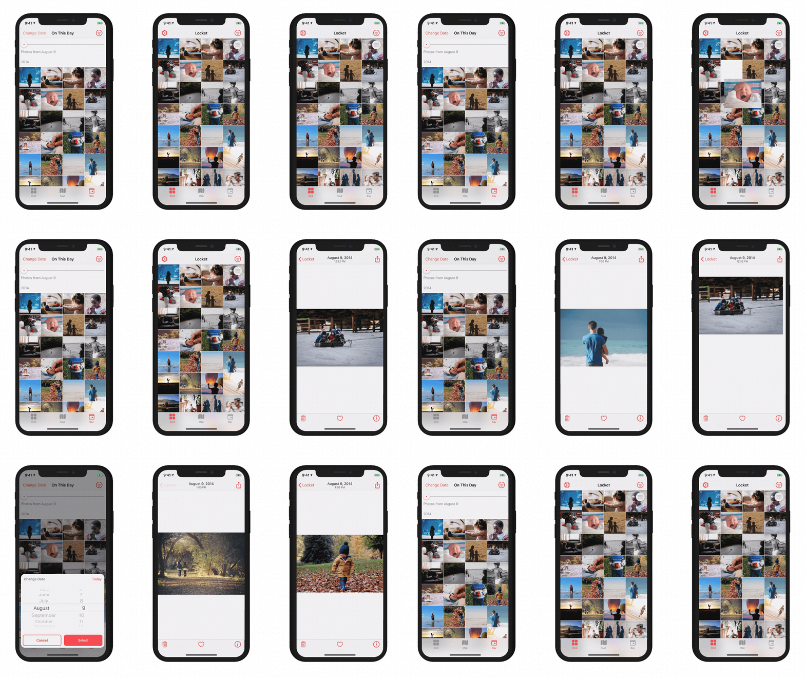
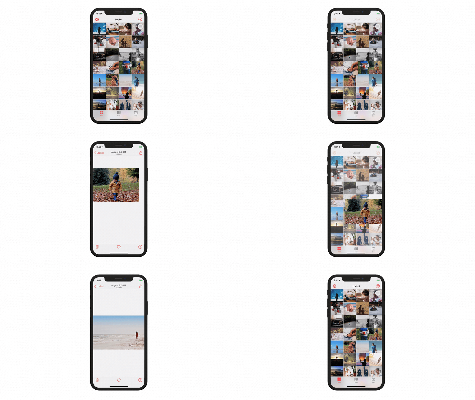
Here’s a more complicated composition, for Locket’s custom push, pop, and interactive-pop transitions. This half-speed GIF cycles through nearly-all of the features of this transition; I’ll outline them all below.

In the above GIF, you see:
- the selected image scales up from its square thumbnail to its position on the photo-detail screen,
- there’s an interactive, cancellable gesture to exit the screen,
- when drag-dismissing, the image scales down during the interactive portion of the transition,
- if you page around in the photo-detail screen, and pop out, the newly-selected image goes back to its proper spot,
- and the tab bar slides down (and then back up again when you pop out)
There are a few more details that aren’t included in this GIF:
- if the photo-detail screen is “focused” (that is, just the photo on a black background) the transition works properly,
- if you’ve scrolled in the photo-detail carousel to an image that’s offscreen in the grid-view, the grid-view scrolls that thumbnail into frame before the transition begins,
- when you dismiss-drag a photo, its z-index is behind the tab bar,
- there’s a non-interactive pop gesture (that you get by tapping the back-button),
- these animations work on a non-“notch” iPhone,
- and the animation timings were hand-tuned on-device using SwiftTweaks.
Phew! That was a long list… but for good reason! These details are essential to a proper, non-trivial implementation of navigation transitions. When any of them were missing, the animations felt glitchy. Paying attention to these details is what makes them feel invisible and intuitive.
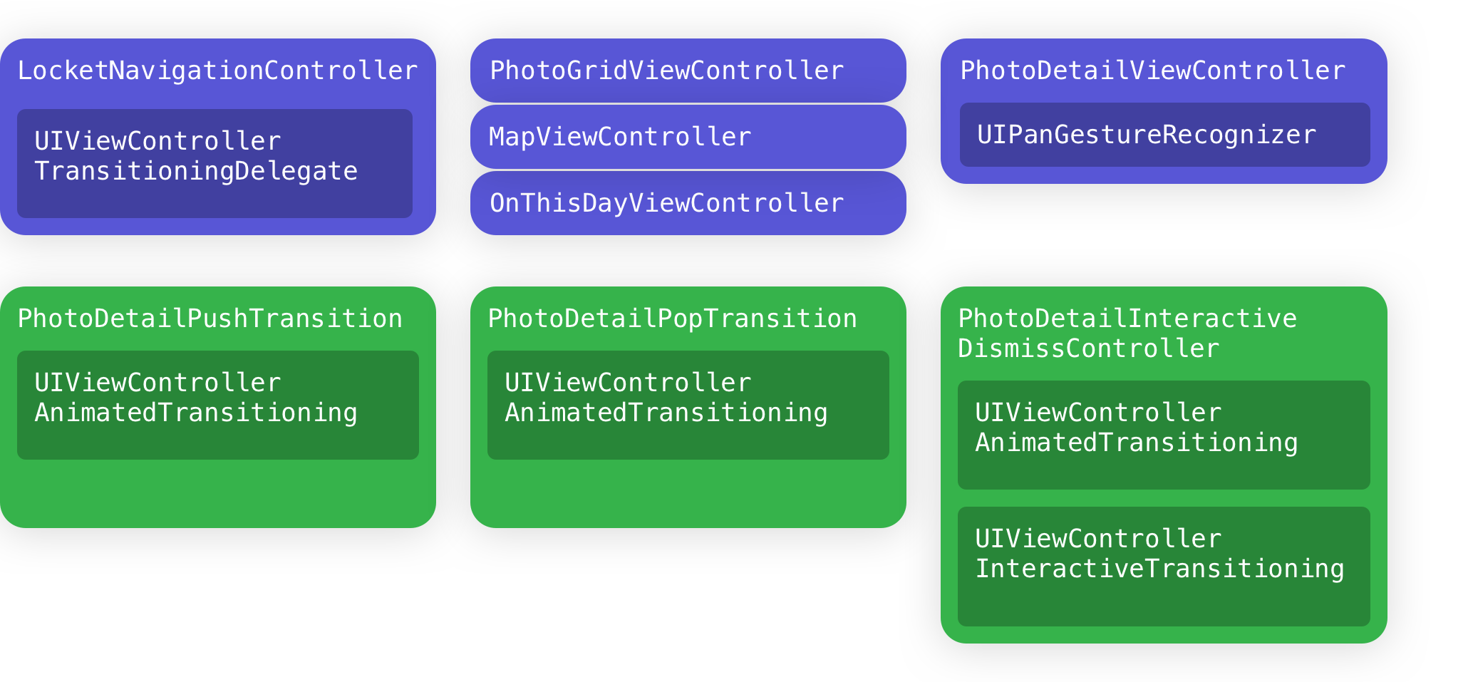
So: how are these transitions built? Here’s that same high-level diagram:

Let’s break this diagram down:
- The
LocketNavigationControllervends different transition controllers — and the transitions don’t know much about the other view controllers in the app. - The gesture that drives the interactive-pop transition belongs to the Photo Detail screen.
- You can see (at a high-level) where the protocols are implemented — there are three types of transition animation (push, pop, and interactive pop).
(And yes! I know these diagrams are way-too-abstract to be a meaningful first-step in making your implementation — I’m removing a bunch of detail here so you can see the bigger picture. We’ll get to the details in future posts!)
Wrapping it up
In this post, we’ve talked about how scary it can feel to approach these APIs - you’re not alone! We’ve also discussed some initial footholds for you to climb this API, with some diagrams to (hopefully) make it feel less-scary. At this point, I still haven’t provided any code, so you’re probably not feeling ready to dive in and implement this in your own app — so please consider this a preamble to a larger discussion of how to implement these transition animations.
What’s Next?
In this four-part series, we’ll learn how to build some non-trivial navigation transitions from Locket Photos. I hope they’ll be a useful reference for you, and make building custom navigation transitions as familiar as making a UICollectionView.
So: let’s keep going! In the next post, we build the simple, self-contained modal transition.
-
Thanks to Dave DeLong for this suggestion! ↩