Throttle & Debounce
In the past couple years, I’ve been working with Reactive Cocoa (RAC) in my daily work, which makes you think about values changing over time.
(Wait, wait, don’t leave! This isn’t going to be a highly-technical post - I’m gonna try to explore a bit of this thinking-about-time stuff here in a way that should be palatable! I think that designers and developers would benefit from thinking about it.)
One neat trick that RAC simplifies is throttling information when a value is changing super-often. In these cases, it’s often helpful to throttle these changes, so that the app doesn’t look frantic or waste data.
For example, you might throttle a user’s search term in a text field, so that a query is only performed every half-second, to avoid having the search results refresh frantically while making soon-to-be-discarded API calls.
You might have noticed that iOS throttles how often you can take screenshots: if you take one, you can’t take another for a few seconds. I suspect this is to prevent accidental duplicates.
Comparing throttle and debounce
Recently, I learned about Debounce, which is kinda like Throttle’s cousin. They are similar in some respects, but are suitable for very different use cases:
-
Throttle says “this value is changing rapidly, I want to at most accept a new value every 0.5 seconds”.
-
Debounce says “this value is changing rapidly, I want to wait until things haven’t changed for 0.5 seconds and then perform an action.”
See the differences?
- Throttle gives you the first value immediately.
-
Debounce always has a delay.
- Throttle isn’t always the most recent value.
-
Debounce is always the most recent value when it fires.
- Throttle feels faster and more responsive.
- Debounce feels more accurate.
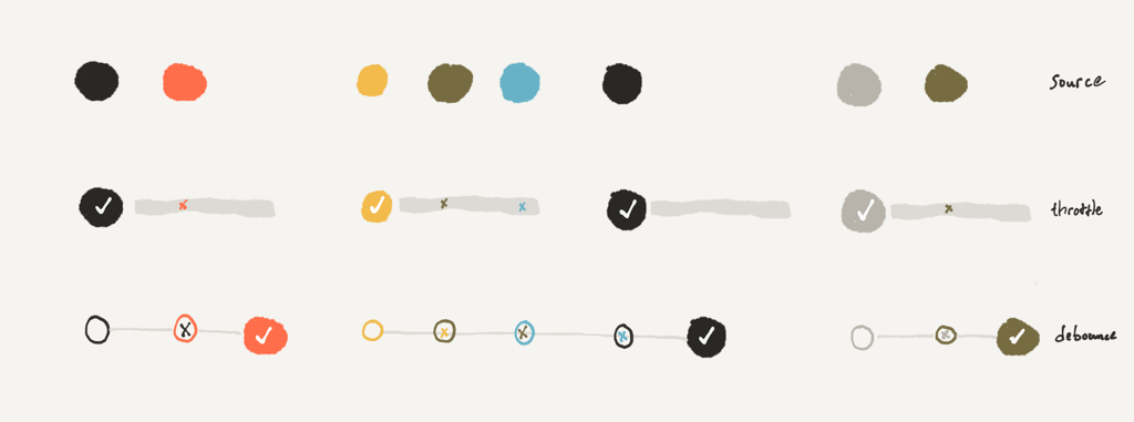
Here’s a diagram to compare ‘em:
 See how throttle “suppresses events for an amount of time”, and debounce “waits until things calm down”?
Both keep your app from being too frantic; they accomplish this in different ways. Let’s talk about when each would be appropriate!
Different tools for different use cases
In the above examples (search fields and screenshots) we talked about throttle. What other situations use throttle/debounce, and which one is right for the job?
If you’ve got a syncing app, it might be helpful to debounce syncs until local changes have settled, to help reduce the number of sync API calls. For example, it probably doesn’t make sense to sync your last-page-read in iBooks every time you turn the page; it likely makes more sense to debounce a minute or two. If you’re editing a text file, you might want to debounce syncing until editing has slowed down, to reduce the number of sync-merges that your API has to handle.
Debounce also appears when taking screenshots, but in a different spot: iOS debounces the hardware button presses to make the “I meant to press these buttons simultaneously” gesture work. If the home button is pressed, there’s a very-brief moment where the system waits to see if the sleep-wake button is pressed too, indicating a screenshot.
Debounce makes another appearance in home button clicking: if you’ve got triple-click for accessibility enabled, the system must debounce when you double-click for multitasking. (Try it yourself! Toggling triple-click changes how quickly iOS enters multitasking mode on a double click.)
I’d bet that the QuickType keyboard suggestions in iOS are also debounced. When you type quickly, they seem to not update until there’s a pause.
Real-world use cases
A potential case for throttle and debounce is in notifications. For example, look at this video of a popular Instagram user’s experience:
Those notifications are flying in! Wouldn’t it be better if Instagram used throttle and debounce to consolidate them? (Perhaps they could use a default debounce of 1 second, with a throttle of 5 seconds - and then as the firehose continues, these values could increase, so a popular user might get a single summary notification at the end of each hour with the number of interactions that had occurred.)
Or, let’s go back to our search results example. Search-as-you-type is a great feature, and using a small throttle helps keep the UI from getting too frantic. However, on a poor or expensive network connection, you might want to increase the throttle delay, or switch to debouncing — these would reduce the data costs without degrading the experience.
If you were making a music-streaming app, you might slightly debounce the skip song button - so if somebody clicks it several times to skip ahead, you don’t bother fetching/playing the intermediate songs.
So, designers, why did I drag you through all of this, too?
If you have these concepts in your vocabulary, you’ll be able to think of places to use them in your designs, and have the ability to express them to your team so they can build ‘em into the real product.
I only very-recently learned about debounce, and I kinda wish I had known about it earlier! Depending on your design tools, throttle and debounce might be tricky to describe, and developers and PMs don’t always have the insight or budget to build them unless they’re requested, prioritized, and designed-for up front.
So: can you think of ways that throttle and debounce might be useful in your design? (Some ideas: Where are values changing quickly? Where do you need to wait-and-check before deciding between two gestures the user is making? Where are things annoyingly repetitive? When does your UI get frantic?)